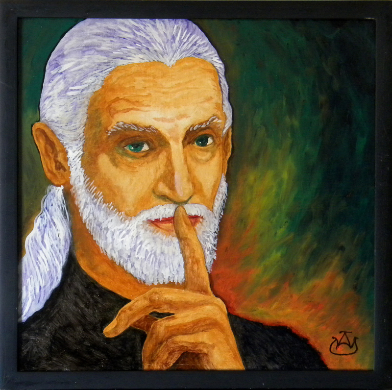
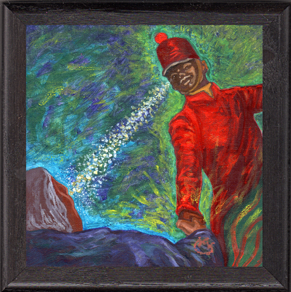
Portrait of Burnell Yow! • oil on 1/4″ plywood panel 12″ x 12″

My first foray into painted portraiture in many a year was inspired by a self-portrait photograph by my friend Burnell Yow! – a black & white photo in which he looked off to the right side with his index finger raised as if to say SSHHH!. I decided to play with the concept, but with changes: to paint the portrait in color rather than black & white monotone, plus turning his gaze toward the viewer, instead of looking away, which dramatically alters a portrait. An interesting experiment with debatable results that was initiated around 2008, but didn’t receive its final reworking until the spring of 2012.

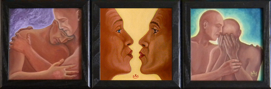
Helping Hand • oil on linen canvas-board 6″ x 6″ • collection of Carla Liguori

This small painting was inspired by the Lajos Kossuth Monument, a statuary group of two figures – one standing, one seated – at Riverside Drive and West 113th Street, in Manhattan. I became familiar with this monument in 2005 as a result of being hired to help organize a NY friend, Virginia Heady, who was settling into an apartment she had just inherited from friends on the 10th floor of the 17 story building immediately behind the monument. I was in NY several times that spring unpacking, sorting, and organizing her earthly possessions. During that time I developed an admiration for the feeling evoked by the sculptural group, which inspired me to take a number of photographs from various angles, one of which formed the basis of this painting dedicated to Omar Kabir who provided a helping hand that spring of 2005.

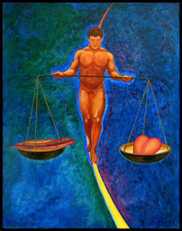
Tight Rope Walker aka Balancing Act • oil on linen 20″ x 16″ • collection of Sharon Ivanov

Another painting several years in the making. The idea for this particular composition went back to a pencil sketch on a file card drawn sometime in the mid 90s, a nod to the challenge of developing “a heart light as a feather” and maintaining a healthy psychological balance in a world that seems pretty unbalanced most of the time. Painting was commenced around 2008, but I never brought the piece to a level of finish that I was happy with. Until the spring of 2012 which saw the reworking of a number of pieces that had been started as early as 2005.

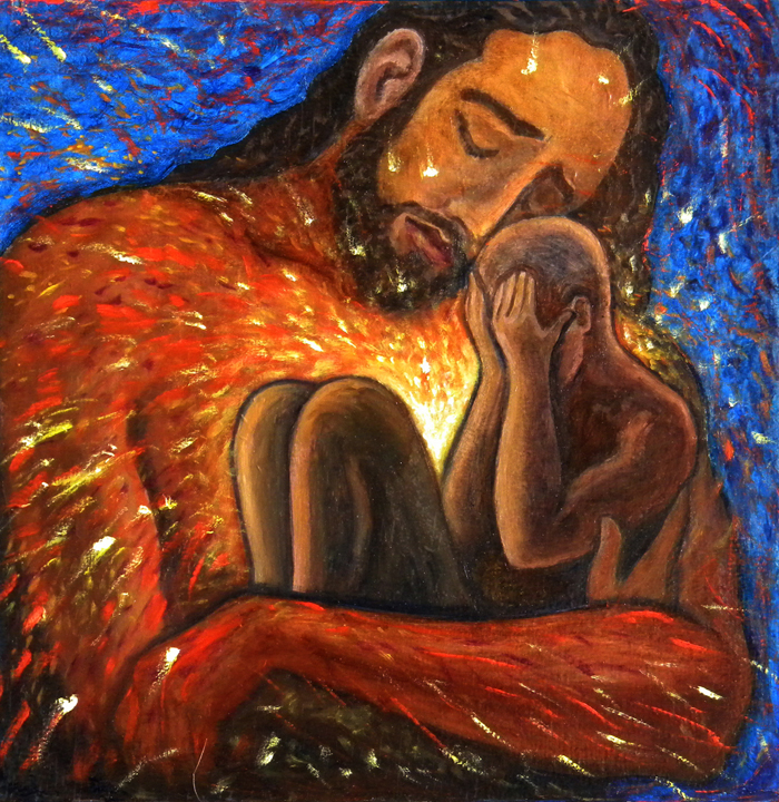
Consolation aka Sufferin’ Jesu • oil on 1/4″ plywood panel, 12″ x 12″

Based on preliminary pencil sketches going back to my time in New York City in the 1970s, this highly emotional expression was the product of a period of feeling deeply sorry for myself that hit me in my early 60s. Art Therapy. Refocusing in this manner the negative emotions that came up became a positive way of dealing with the negativity that otherwise threatened to incapacitate me during this time when nothing seemed particularly stable in my life.

What Can I Do? • oil on the textured side of a masonite panel 10″ x 13″

In the first go-round with this painting in the early 2000s, I used letters above and around the figures to literally spell out a message four times: “WHAT can i do? what CAN i do? what can I do? what can i DO?” After living with the painting that way for some time, I decided to eradicate the words under layers of colorful impasto. This choice was based on a sensation at the time that the words distracted from the power of the image itself. This could change…

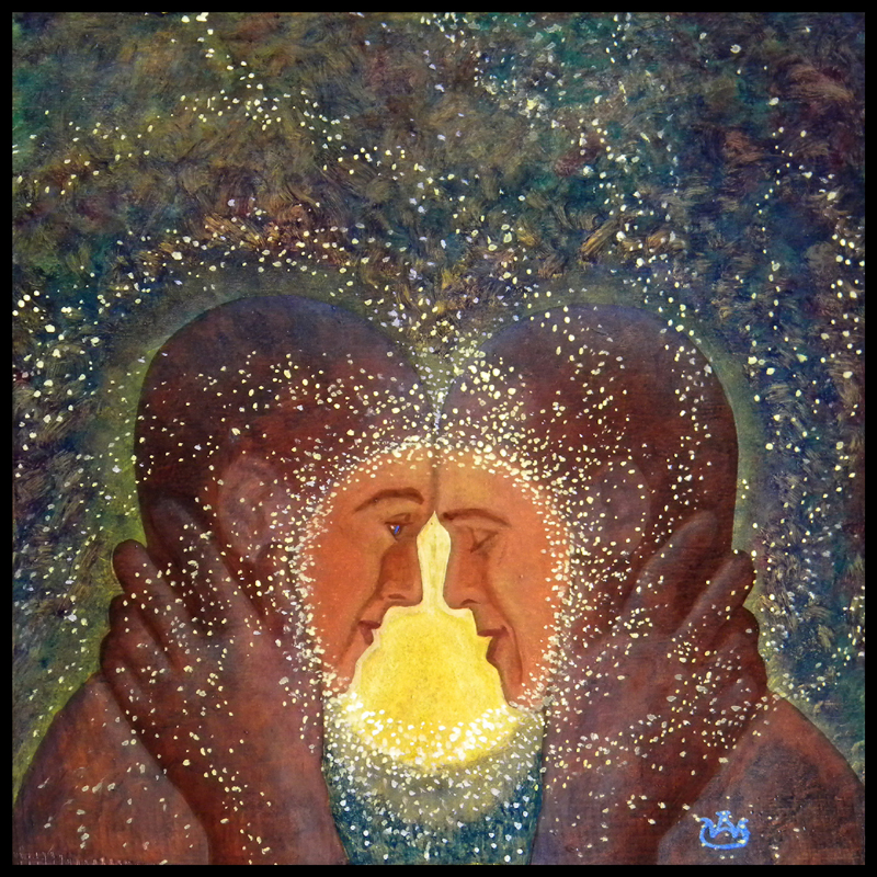
Talk to Me • oil on 1/4″ plywood panel, 12″ x 12″

Another years-in-the-making painting started around 2005; the result of an ongoing period of emotional challenge sparked by an interesting but intensely strained relationship with Omar Kabir, a talented trumpet player now living in Munich, Germany. All-in-all, it was one of the great learning experiences of my life, prompting me to keep moving onto the next level of psychological development, an ongoing life process.

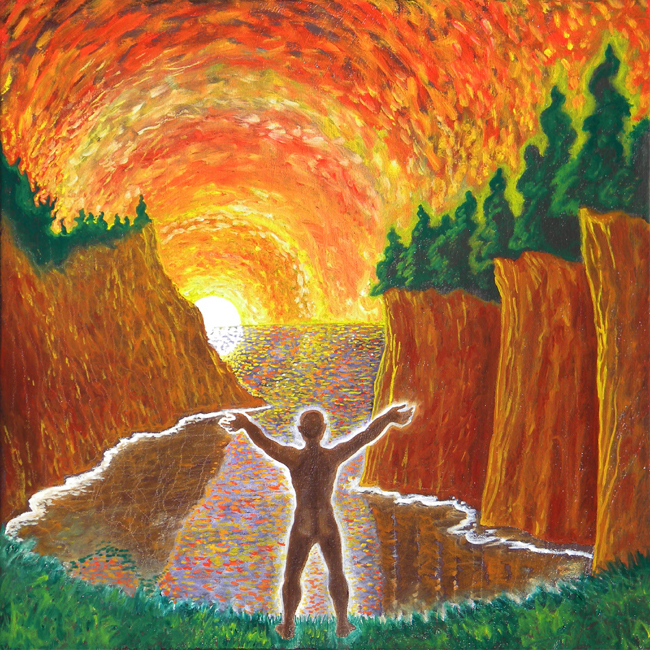
Behold the Light • oil on linen, 18″ x 18″

This is one of three paintings in this posting that were not the reworking of older paintings. Admittedly the basic idea of a figure seen from the back with arms raised in the gesture of adoration and surrender is a repeating image throughout my work that goes back to the first stirrings of my art. Painted in two relatively brief sessions, this pointillist-driven painting is one more tribute to the magic of Vincent van Gogh, whose work did not find favor with me when I first encountered it as a teenager. Time has revealed his genius! Acquired tastes are sometimes the most significant influences in our lives.

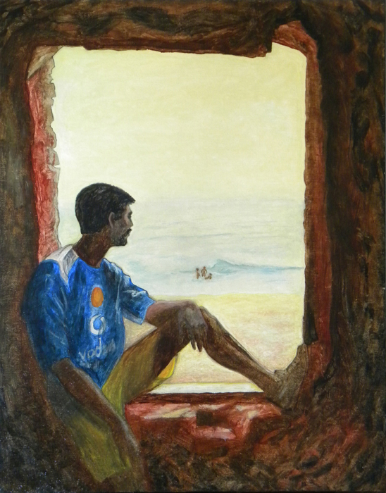
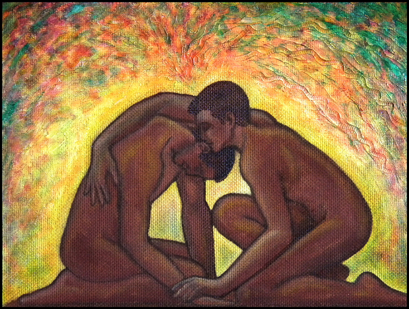
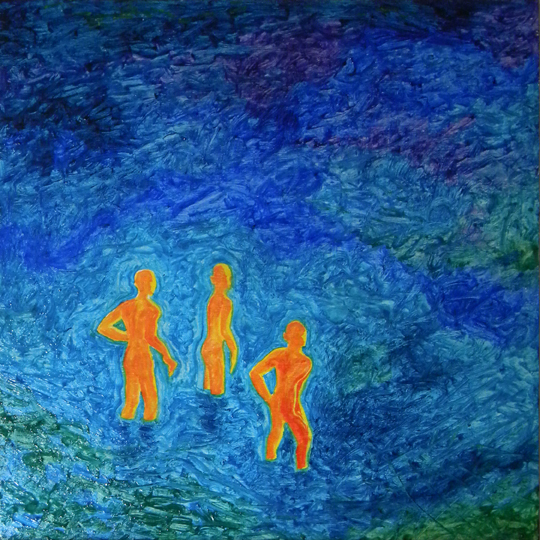
Devas #2 aka I Sing the Body Electric • oil on masonite panel 12″ x 12″

This was the second visit to an idea sparked by my time in India in 2005 with Omar Kabir. While visiting the tiny Bay of Bengal town of Gopalpur-on-Sea, we were exploring an abandoned ruin that sat at the edge of town, overlooking the magnificent beach that dropped off at a precipitous angle, creating one hell of an undertow. We witnessed three Indian youths sporting in the surf, which inspired me to pull out the camera and see what I could capture. The result was a set of photos which inspired this series of paintings. A third is still in the works…

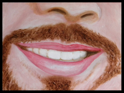
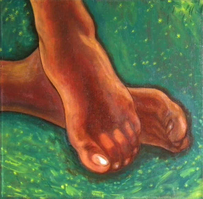
The Feet aka Barefoot in the Park – oil on linen 18″ x 18″

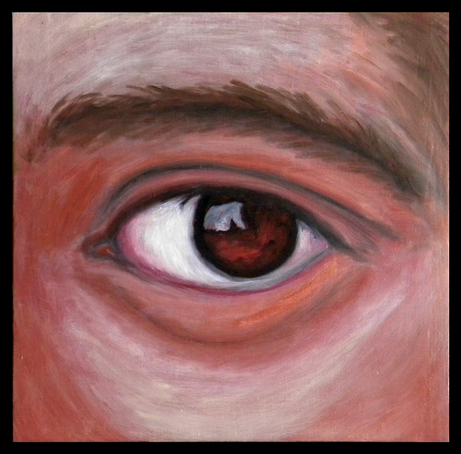
#4 of an evolving series – These Are A Few of My Favorite Things (Body Parts) – that I first sketched out as an idea on a file card back in the mid-80s while I was still living in Portsmouth, New Hampshire. The first realization in paint was The Ear, done in the early 2000s. The Eye was next, a few years later, followed by The Mouth. The Feet was painted especially for a show at the DaVinci Art Alliance in July 2012 themed Summer in the City.

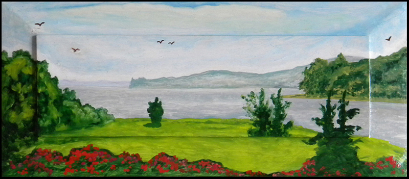
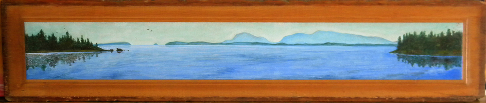
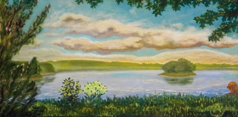
Tidal Cove, Newcastle, New Hampshire • oil on canvas 12″ x 24″

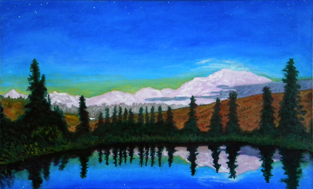
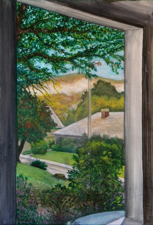
Of all the paintings in this posting, this is the one longest in the works. Started in 1985 as an in situ plein air painting while living in Portsmouth, New Hampshire. The location was a lovely quiet cemetery overlooking a tidal cove in the seaside community of Newcastle, NH (seems like there’s a Newcastle in just about every state, like Springfield). I’ve reworked sections of this painting periodically since the mid-80s, the most recent revisions being made in the spring of 2012, just twenty-seven years after its beginnings.

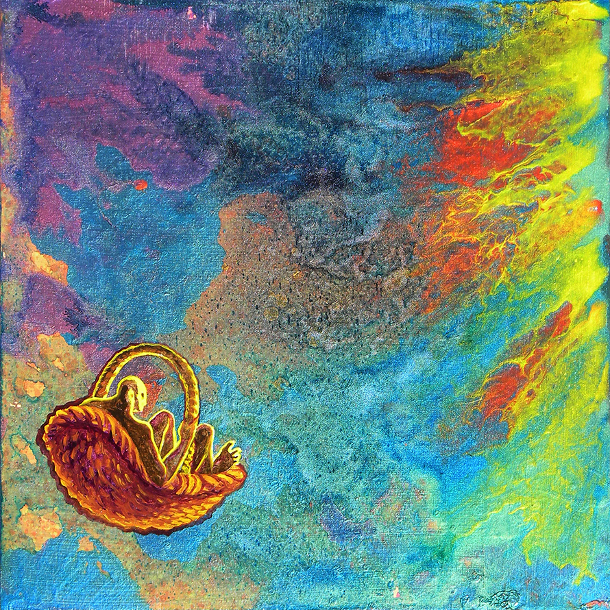
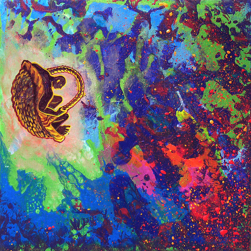
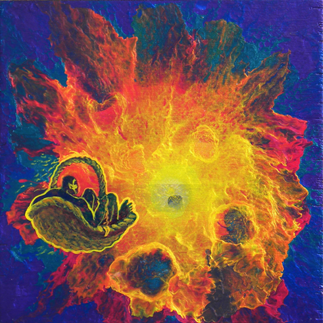
To Hell in a Hand Basket, numbers 1, 2, & 3. Acrylic on plywood panels 12″ x 12″ each.

Playful pieces inspired by an early spin-art-type painting done in the early 2000s. These are from my Big Bang series of colorful sunbursts in iridescent paint. The first is still available. #2 is in a private collection. #3 is in the collection of Nikki Hansen.

{ 0 comments }

Barn Memories aka Ghosts of the Past • oil on linen 10” x 18” • collection of Mark Braber

This is one of many paintings created in 2012 that were inspired by old photographs, this one taken by myself a number of years ago while vacationing in Maine at my family’s farm in Dayton, revisiting the Source of all my Strivings. The fields surrounding the barn portrayed in this painting (which hides the house where I grew up) were my playground as a child. With each passing year the perimeter of my explorations expanded until I could go all the way to the Saco River by myself without supervision. And eventually into the surrounding woods themselves. Freedom!

Haying Season at Cole Farm 1955 • oil on linen 10” x 31” • price on request

Another painting based on a small b&w snapshot by my brother Wallace that captures a break in the action of making hay, seen through the trees a few hundred feet away. This was the second time I had revisited that theme; the earlier painting – Summer of ’55 – started in 2011 and brought to completion in 21012 – was featured in the previous posting. 2012 signaled an ongoing fascination with producing painted representations of the land I grew up on. I was particularly drawn to portrayals of the big two-toned farmhouse on the hill where my grandparents lived, seen in this painting as well as others that follow. This was a place that provided security and a sense of timelessness to me as a child, a constant I could always turn to where I was loved unconditionally during that innocent time of growth.

Cole Farm #3 • oil on linen 10” x 26” • collection of Mary Gay Baldyga

Yet another look at that farmstead on the hill overlooking the valley where I lived with my parents and brothers; a place that was like a second home to me, a refuge, providing an alternative place of exploration for those times when the lure of the fields and woods lost their appeal temporarily due to weather, or changing interests as I aged.

Paul Bachmann in Repose • oil on linen, 24″x 17″ • price on request

Another painting based on a photograph dating back to the summer of 1974 when a NY friend – Paul Bachmann whom I had met through my second partner Robert Mayberry – visited me in Maine. That was at the summer I fled NYC thinking “the end is near” and taking all my possessions, storing them in my dad’s barn in Maine, living with my parents for the first time since the summer of ’66, eight years earlier. I found work briefly with Mark Douglas, a writer of books on astrology, but eventually settled into a job in an upholstery shop until October when I realized the truth of the axion that “you can’t go home again” and returned to NYC for another five years.

Looking West • oil on canvas-board, 12″ x 16″ • collection of Audrey Terry

Unlike the other paintings featured so far, this one was not developed from a photograph, but was started in situ as a pencil sketch of the view looking west from immediately inside the front of the barn where I grew up. It was also the first painting depicting this particular view; a few of them being devoted to my grandparents’ House on the Hill, and a number depicting the view looking east over open fields leading down to the intervale of the Saco River. This painting also includes one of my first rather cartoon-like depictions of an automobile – at least half of one.

Down By The Riverside • oil on linen 17″ x 24″ • price on request

Started in the spring of 2012, and brought to completion in 2016. This painting was a tribute to my very first oil painting; one that had been done in September of 1973, depicting a favorite spot beside the Saco River in Dayton that I had known since childhood. Instead of going to the same physical spot and reprising the view which had changed rather radically in the intervening years, I conjured memories of the place and let my imagination do the rest, creating a bend in the river that doesn’t really exist other than in my mind.

Down the Intervale #8 • pencil plus oil on primed pine board 12″ x 48″ • price on request

In the summer of 2011 I drew pencil sketches of the same limited view of the Saco River intervale on both sides of a pine board panel as an exercise in trying to correctly perceive proportions, drawing free-hand on a panoramic scale. It was surprising to see how different the two sides came out; you can see them in my August 23, 2013 posting. In the spring of 2012 I painted the first of the pencil-drawn sides with the colors of autumn.

Down the Intervale #11 • oil on a wooden half door, 44″ x 30.5″ • price on request

While vacationing in Maine that autumn, I rediscovered a damaged door stashed away in the barn I’d known since childhood; my imagination was immediately sparked. I cut off the damaged bottom section, carefully cleaned then gently sanded both sides, followed by priming the inner panels. Painting proceeded soon thereafter. This particular work is a a reminder that I’m no Audubon. One of the interesting features of the door is the very worn section of the wood immediately above the door handle on the left. I can only guess what could have created such a worn spot; and I suspect it was animal.

Cole Farm on the Hill #1 • oil on primed plywood panel, framed with antique window sash (sans glass) 30” x 24” • price on request

In the summer of 2011 I started the above artwork while vacationing in Maine, getting only as far as a rough pencil stage. I left the panel there, and resumed work on it the following summer, transforming it with a vibrantly colored sky and a garden that exists only in my imagination. Inspired a bit by Vincent van Gogh, as is the following.

Inside Looking Out #2 • oil on canvas-board 24” x 18” nailed to single-slab pine board 27.5” x 19” x 1” • price on request

An artwork started in 1982 while I was living boy myself in Dayton, Maine for a couple years, brought to completion the summer of 2012 after only thirty years. The time was one of the most solitary times of my life, living alone in an old house that belonged to my cousin Emily Cole, who was very generous with me during that time of discontent and questioning.

Inside Looking Out #16 aka “Under the Ash Tree” aka “O beautiful for spacious skies, for amber waves of grain” • oil on plywood panel framed with antique window sash 20” x 25” • price on request

Another plein air piece painted in situ while on vacation in Maine that summer, sitting out on the front lawn in the shade of another older ash tree, with hay mowing in progress in another field. This was a timely painting; within days, the amber field of grain was cut to stubble once again.

Down the Intervale #14 • oil on luan plywood panel 9” x 19” • price on request

During my September stay in Dayton, the acres of fields surrounding the farm were ripe for what is known as ‘third crop’ – the final cutting of the tall grasses gone golden, to make hay while the sun shines. Ensconced at the back of the barn that I had known and loved intimately since childhood, I painted while they worked, industriously capturing a moment when two of the team of three Lambert brothers were visible doing their various parts. They worked together in the cutting, teetering, baling and taking the hay away, the gift of the earth to be eaten by cows and horses, and possibly others, later that winter once outside grazing was sparse.

Cloud Show • acrylics on luan panel 6″ x 21″ • price on request

Clouds have been a never-ending fascination for me, from a very early age. There are so many painters whose depictions of clouds provide ongoing inspiration to me, including Rockwell Kent, Thomas Hart Benton, John Constable, and particularly the great Jacob van Ruisdael. This particular painting was done at the very end of my vacation in Maine that year.

{ 0 comments }

2012… a memorable Baker’s Dozen

by Alden Cole on February 20, 2019 · 0 comments

2012: first project of the new year – “Center City Philadelphia #7” aka “Eyes on the Skies” aka “Waiting” • oil on plywood panel, in a 24” x17” frame, hand-crafted by another artist. This frame originally held a mirror for an entry way (thus the wooden drawer knobs at the bottom). I found the frame with its mirror broken – a store casualty – in the basement of SOTA, my friend Frank’s crafts gallery on Pine Street years ago, and begged if off him with plans to create a painting to fill the void, which is exactly what I did. Now in the collection of Frank Burkhauser.

2012 was one heck of a year – easily one of the most productive years of my life. The 12.21.12 buzz was in the air, another ‘end of the world’ prediction that had become a virtual cottage industry based on cultural paranoias. Apparently I was not totally free of feeling the tenor of the times, since I decided early in the year that IF this was going to be IT – the last one – then I was going to try to make the most of it creatively. And try I did. Whether it worked or not, you’re about to see, as ! review what was for me a significant year to remember.

Center City Philadelphia #6 • oil on wood panel that is the bottom of a bureau drawer measuring 17″ x 7″ x 6″. This small piece had been started in 2011, but didn’t get its final brush strokes until shortly after I had finished the other Center City painting above, which apparently inspired me to complete this one.

In this first posting in over two months I’ll start dealing with this incredibly productive year of 2012 by focusing on a baker’s dozen of paintings that occupied much of my time during the first few months of the new year – ultimately it was a winter of great content as I turned creative dreams into realities, surprising even myself with some of the results. My attention was divided between several interests, the first being my immediate environment – thus the Center City paintings depicting the view looking Northwest towards Philadelphia’s skyscraper skyline from my studio on the third floor of my South Philadelphia row-house, part of a series of paintings begun the year before.

“Yearning” aka “Romeo, Romeo, wherefore art thou?” • oil on linen 20” x 16” • collection of Ed & Sophie Bronstein

Second was a plan to turn a small selection of photographs I had taken of people into paintings, starting with the composition at left, based on a lucky photograph taken with a zoom lens, one afternoon around 2008. I was shooting the skyline, my usual fascination, from my third floor studio, when I noticed a young neighbor whom I had not met, who lived in a house on Annin Street, a block north, whose back yard was two houses east of being back-to-back to my own backyard. From the distance dividing us I had seen her on occasion looking out her third floor window, but this time she had lowered the top sash and was leaning over its top edge, checking out the gardens. I shifted focus and took several photos of her. She never looked my way. After about ten photos I became self-conscious; not wanting her to feel self-conscious about being photographed, I shifted my own focus back to Center City. When I glanced back a few seconds later, she was gone. Once I looked at the photos on computer I knew I had captured a very fine composition, crying out to be painted. Only took a few years from original inspiration to completion on the easel, but well worth the effort. Incidentally, it was one of those paintings that happened quickly and almost effortlessly in three relatively brief sessions, without being overworked, the bane of much art. And it even won me a third place ribbon in a DaVinci Art Alliance-sponsored show of work inspired by the bard’s Romeo and Juliet the following year at the Lantern Theater. Now in the collection of one of Philadelphia’s finest painters, Ed Bronstein.

“Sea Gazer” aka “Omar Kabir – Wound Down” • oil on linen 24” x 18”

Here we have three paintings dealing with my interesting obsession with talented jazz trumpet player Omar Kabir, whom I had met in 2004, then traveled to India with in June 2005 to see a property he had inherited a portion of through his father. We were there for about two weeks in Gopalpur-on-Sea, a small community on the Bay of Bengal midway between Chennai (Madras) in the south and Kolkata (Calcutta) in the north of that amazing subcontinent. What a humbling education in how varied and yet how similar is our world. In early 2012 I started developing three different photos of Omar into paintings. The one above was based on a photograph taken while we were in India. Some time after finishing this first painting, I found out from Omar that the stretch of beach he is overlooking from the empty window was the same beach where his Indian father had drowned two years earlier. Memento Mori…

“Hot Stuff” aka “Omar Kabir – Wound Up” • oil on linen 10” x 28” • collection of Omar Kabir

When I first met Omar Kabir in 2004 he owned a house on Passyunk Ave just north of Catharine Street, so we were virtual neighbors in town. As we became friends I started going to jazz clubs with him on occasion – a totally new exploration for me – where I realized what an electric performer he was. The painting above is based on a photo taken at a Summer Solstice celebration somewhere on the campus of Drexel University in 2005, shortly after we returned from India. A professional musician may notice that things about the trumpet seem slightly askew; that’s because I flip-flopped the photograph I was working from for compositional reasons, so the trumpet valves have been reversed.

These Are A Few of My Favorite Things” aka “These are a Few of My Favorite Body Parts” – #3: The Mouth • oil on linen 12” x 16”

Omar had some of the most perfect teeth I had ever seen, possibly the result of early dental work. He had a stunning smile which seduced not only myself, but many another on occasion. The detail that became a painting was cropped from a full photographic portrait, and became the third addition to a slowly evolving series inspired by that classic tune from The Sound of Music by Richard Rodgers, with a little alteration to Oscar Hammerstein’s lyrics… The idea for the series goes back to a 4” x 6” recipe card sketched out in the early 80s while still living in Portsmouth NH. The first of the series was the Ear, followed by the Eye.

“Summer of ’55” • oil on panel 15″ x 30″ • collection of Land Cole

My third area of interest that winter-into-spring was in crafting a few paintings of the Dayton, Maine farming environment in which I had grown up. In some instances I used old snapshots by family members, or by myself, as a springboard to creativity. The inspiration for the painting above was a small black & white snapshot taken by my brother Wallace in the summer of 1955, focused on the activity of summer haying that was taking place on our grandfather’s farm, a short distance from our back yard. Commenced in 2011; brought to completion and sold in the spring of 2012.

“Moonrise” aka “Down the Intervale #9″ • oil on panel, framed with antique window sash, 21″ x 25” • collection of Carley Dunn

This painting had been started in situ while vacationing in Dayton in the fall of 2011, but didn’t get its finishing touches until the spring of 2012, back home in Philadelphia. A certain amount of imagination went into painting this, as my aim was to create a night scene, even though I was actually working on it during the day; an exercise in creative inspiration and visualization that paid off. This was one of the first of several paintings that incorporated old window sashes (sans glass) that had once been glazed windows on the south side of the barn where I had grown up. My passion: putting found objects destined for the land fill to another use. Sold that same year to an Alaskan admirer while I was there in August.

“Last Load” • oil on linen canvas 18″ x 36″ • collection of Liam and Missy Braber

At the time of my parents memorial in 2009, a cousin gifted me with a number of b&w snapshots, including one that became the basis and inspiration for this painting. The b&w snapshot was taken in the summer of 1942 at a time before the advent of hay-baling machines which changed the whole business of haying. As you can see, there’s just one big pile of loose hay that had been collected using the old traditional method of loading the haywain with long-handled pitch forks. The original photo, taken a couple years before I was born, shows the last load of hay for the day coming into the door-yard at Cole Farm, with various family members as part of the tableau – two first cousins, brothers Gordon and Bob Cole, who are the youngsters duking it out on the lawn; a great uncle – Winfield Lee Cole – leisurely smoking his pipe close by; on the right, my aunt Charlotte standing at the rear of the hay wagon; and my dad sitting atop the load of hay. Presumably my uncle Robert was driving the tractor. The painting has an interesting history of revisions; although started in 2012, and sold to friends in 2013, I continued to revise (improve?) rework the painting until last year when it was time to say Basta!

“Fall Storm’s a Brewin’ “ aka “Down the Intervale #13” • oil on mdf panel 6” x 36” framed in antique oak • collection of Victoria Nevins

Possibly the most panoramic of the many paintings I’ve done of the Saco River Intervale that lies a mere quarter-mile behind the farm where I grew up. Over the years I’ve revisited this view in paint numerous times, as it is one of my favorite haunts of memory and the imagination, a world apart from where I live now.

Cole Farm #2 • oil on linen 18” x 24” • collection of Marge Cole Thompson

There’s no place like home, and for me the house portrayed in the painting above was HOME almost as much as the house in the valley just a few hundred feet away where I grew up. There a grandmother and two aunts showered me with love and affection that kept me coming back for more. In addition, the farm was the locus of lots of activity, because of its being an active dairy farm, with milk-trucks coming and going, a dairy factory packaging milk products that made a fair amount of noise, and cows in the fields where the horses now roam.

Purple Mountain Majesty • oil on linen 18” x 24” • collection of Pasha Buck

Alaska was on my mind that spring, as a result of my older brother Wallace, who has lived most of his adult life in Alaska as a successful entrepreneur, contacting me with an invitation to visit him and his family for the last two weeks of August. Destination: Camp Denali, their tourist facility nestled in the heart of Alaska, an impressive site which has been featured as one of PBS’s Great Lodges. The camp has one of the more spectacular views of Denali, North America’s tallest mountain, formerly known as Mt. McKinley, which has a summit elevation of 20,310 feet (6.190 meters) above sea level. According to Wikipedia, Denali is the third most prominent and third most isolated peak on Earth, after Everest in the Himalayas and Aconcagua in the Andes. Inspired by the prospect of such a journey which I had last made in the summer of 1984, I pulled out photos from the earlier visit and created two paintings that spring: the one above which shows a view along the park road from Camp Denali back to the park entrance about 90 miles away; the other painting below focuses on that amazing land mass known as Denali – the Great One – with Wonder Lake a mere speck in the distance.

Denali as seen from Nugget Pond, Camp Denali, Alaska • oil on linen 18” x 30” • collection of Robin Lowry

This trip coincidentally introduced me to the work of writer Herman Melville (1819-1891) for the first time, with my initial reading of Moby Dick; and re-introduced me to the work of artist Rockwell Kent (1882-1971) whose influence on my own art goes back to my teens. It was also a year that saw the establishment of a series of daily emails, set in motion via a December review that challenged me to write an email every day for 37 days in a row, from 1 December to 6 January 2013. I repeated the challenge the following December, after which it became a daily creative meditation. Thus the Slow-Motion Memoir was set in motion…

Of the baker’s dozen paintings above, I sold nine to family and friends, which is an encouraging statistic, telling me what I could focus on if I want to sell more paintings…

{ 0 comments }

2010-11: giving old work a new life, plus…

by Alden Cole on December 4, 2018 · 0 comments

2010-11 saw the useful repurposing of earlier works on various substrates – paper, canvas, and plywood panel – into signage for events connected with both the Dumpster Divers and the DaVinci Art Alliance. The two pieces above – stylized night and day scenes – had been created as reduced-size preliminary comps to show a client ideas for a frieze that I eventually painted on two walls of one of their bedrooms. However, the final design was not based on either of the two pieces shown here; but that’s another story…

The plywood panels which measured 10″ x 48″ became the basis for signage created for the
Dumpster Divers when we occupied a gallery space on South Street in 2010. The night scene was morphed into a sign for Randy Dalton’s Blue Grotto, which was one of the highlights of the gallery. The day scene was transformed into a sign for general gallery use, stating what I considered to be the creative intent of such an eclectic gallery:
“Look Around! Be Amused! Get Inspired!”

In the spring of 2011, the DaVinci Art Alliance put up an exhibit of artworks inspired by William Shakespeare’s “A Midsummer Night’s Dream” in collaboration with the Lantern Theater’s production of the play. I got onto a roll with transforming what I considered inferior artworks from my Spin Art
period into signage for the occasion; works on paper that seemingly had no future. I figured “What the heck: recycle ’em or get rid of ’em.” The gallery space for the exhibit was in the rehearsal space in the basement of the theater, in what was sometimes referred to as the Black Box. As you can see from the attached files, I had an interesting time taking some very colorful artworks from the late 70s when I was painting with liquified oil paints, then adding type that was intended to serve as directional guides for the audience to visit the exhibit downstairs during intermission. I have
to admit that this was not terribly effective ultimately. possibly due to lack of clear legibility; possibly due to lack of audience interest. Whatever, I had a great time giving these old pieces a new lease on life, even if only a temporary one. At this point they’re probably bound for an event that friends Michelle Post and Dave Carrow call their annual Bonfire of the Travesties, which is where a lot of artwork that probably shouldn’t have seen the light of day has the opportunity to go up in flames and provide a little warmth at the same time.

For the exhibit of artworks
inspired by A Midsummer Night’s Dream, I was able to enter three paintings, one of which was considerably larger than the usual size limitations for DaVinci shows; the exhibition area was spacious and welcomed larger pieces. The first art submitted was the one at left; painted with colorful liquified oils on paper, measuring 26″ x 32″ – another left-over similar to the altered artworks above from the spin art period of the late 70s; a piece that I had a great fondness for which had gone through minor and major revisions with the years, morphing from totally abstract to being populated with numerous figures that were stenciled onto the background. I saw the piece as expressive of the restless motion conjured by the mischievous fairy Puck during the play: ““Up and down, up and down, I will lead them up and down, I am feared in field in town, Goblin, lead them up and down”

“Titiana, Queen of the Fairies” • oils on canvas 26″ x 65 • collection of J.T. Davis. Coincident with the show was a commission from a friend to do a painting of a woman reclining, as a tribute to his wife, based quite literally on a photograph of Betty Page, one of the most famous of the 1950s pin-up girls. Once painted – as a blonde instead of a brunette – I realized that it could double as a tribute to the beauties of Titiana, the consort of Oberon, King of the Fairies – those two contending lovers whose personal squabbles created much of the dynamic of Shakespeare’s play – so I entered it in the show as well, with a NFS indicated. Admittedly a flawed painting, but one which provided a great practical learning experience in the doing.

“Awake and Join the Dance” • oils on linen 16″ x 36″ * a painting first started in either 2008 or ’09 and finally brought to completion in early 2011, especially for this exhibit. Although the initial impulse for the painting was not specifically inspired by A Midsummer NIght’s Dream, the feelings evoked by the play have a very similar resonance to what I was trying to create with this painting.

“Doing the Warhola” • concept piece involving four trumeau-style artworks to be hung as pairs at 90 degrees to each other, placed in two adjacent corners of a room; combined with a floor piece inspired by Andy Wahhol’s dance-step diagram paintings. These were created at the end of 2011 for an early 2012 show honoring the 25th anniversary of Andy’s death, devoted to celebrating the impact of one of the most influential artists of the 20th century, a subject I could go on and on about, for better or worse…

{ 0 comments }

2011: taking a look at my inner nature

by Alden Cole on September 4, 2018 · 0 comments

The Eye: #2 of a slowly evolving series titled These Are a Few of My Favorite… Body Parts • oil on linen 18” x 18” • based on a detail from a photograph taken of Omar Kabir while we were in India in June 2005 for two weeks.

This series was inspired by that captivating tune from The Sound of Music by Richard Rodgers using some altered lyrics based loosely on those by Oscar Hammerstein. The first was The Ear, pointed in 2004. Since then I’ve painted The Mouth, The Feet, and The Buttocks. As I said, it’s a very slowly evolving series, based on a quick 4″ x 6″ sketch made in the mid ’80s while living in Portsmouth, NH. All it will take to complete the series is “Time, Strength, Cash and Patience.”

Face to Face – a triptych measuring 7” x 21” composed of three individually framed oil paintings on linen canvas-board, each 6” x 6”. The individually framed paintings, first created in 2005, were combined into a single artwork especially for a 2011 DaVinci Art Alliance exhibit dealing with the theme Triumph Over Discrimination. All three paintings were seen as single entities originally pointed for a series titled Tenderness where I explored more of my emotional attachments going back to childhood.

Illusions of Artistry …Now & Then • two pencil drawings on 8-1/2” x 11” bond paper. The left-hand image is from 2004, done at age 60, with some self-knowledge under my belt about my particular life as an artist. On the right is a difficult-to-read image because the pencil lines are so light, done in 1962, at age 18. I was a freshman at RISD, my first months away from the farm and living at home, naively contemplating the illusory delights of life in the city as a ‘cool dude’ artiste. I mounted both drawings on black presentation board, making them a single work of art, framed in wood 22” x 28”, for a DaVinci Art Alliance exhibit with the theme “Then & Now” the summer of 2011.

Clownin’ Around: Now (2005) & Then (1952) • a diptych – each framed piece measuring 25” x 19” • on the left, Now, painted in oils on linen canvas-board in 2005. On the right, Then, a crayon drawing done when I was probably around age 8 in grammar school; a drawing which survived the inevitable destruction of “putting away childish things” that happens in adolescence, because my aunt Charlotte had saved it, then returned it to me when I was an adult appreciative of those earliest strivings.

In the summer of 2011 the DaVinci Art Alliance celebrated its 80th anniversary with a show themed Then & Now. Standing the phrase on its head Now & Then to give it a more familiar and poetic twist, I toyed with several variations based literally on old pencil drawings I had created during my junior and senior years of high school, plus a couple racier ones created the next, my freshman year at RISD. The originals in pencil on bond size paper were done for my own pleasure, not to fulfill class projects; nor did I seek the attentions and criticisms of my fellow students for these sentimental meanderings in pencil. These drawings were my therapy at a time of intense personal conflict: recognizing my sexual nature, and negotiating the transition from ‘childhood’ to ‘adulthood’ which I was taking VERY seriously at the time – I could write a book about it, but became an artist instead. Reviewing old drawings in 2011, approximately fifty years after their original creation, provided an entertaining spring, if not a lot of salable work. I used a few as springboards to new work. Illusions of Artistry: Now & Then, featured a few days ago, was an example of this revisioning, and my first choice as one of two possible entries to the DaVinci exhibit. Other spring experiments were often larger and in color; I was having a great time exploring the concept, because I was creating with a sense of humor that was lacking in the originals. However, because I could only put one other piece besides Illusions of Artistry into the DaVinci show, I opted for a diptych combining a painting that was a few years old at at the time, plus a work from childhood that had literally inspired it, Clownin’ Around – Now & Then. Rest assured, paintings of clowns is not a genre I have pursued any further…

Le Jongleur (The Juggler) • oil on canvas 36” x 24”

I started this particular canvas sometime in the mikd-‘70s around the time I was just beginning to paint. Living back in New York after having moved out of the city from June to Octaber 1974, I was cautiously trying to get my feet wet using this new medium of oil painting. that I had no preliminary training for. I’ve totally forgotten what the subject matter of the original first layer was, but it was a disaster. The canvas changed radically over the years, becoming the basis for more experimentation with imagery and medium than most of my other work. It wasn’t until 2011 that I finally said “Basta!” and signed it. I kinda wish I’d maintained a visual history of the many rewordings the painting experienced, so I could see how many different paintings actually exist one on top of the other.

Liebestod • colored pencils on matte-black card-stock 24” x 20” framed in antique Victorian-era frame 30” x 26” • $390

This is another work with a long history from inception to signing: first sketched out loosely on black paper with colored pencils in the late 70s while I was still living in NYC. The inspiration was music, the final scene from Wagner’s Tristan und Isolde which had seduced me with its magic years before, a piece of music that had inspired earlier artworks. The drawing was left in a very unfinished state until the fall of 2011 when I was recognized its inherent beauty, even in such an unfinished state, and was challenged to bring the piece to completion for a fall exhibit at the DaVinci Art Alliance themed Triumph Over Discrimination, although I can’t remember now my rationale for the connecting this piece to the show’s theme. Artistic License apparently.

Blue Serenade • oil on linen 20″ x 48″

Another painting begun in the early 2000s that was part of a series of erotic works that were my major focus at that time. In 2012 I reworked certain passages, but like many other paintings still in my possession, it feels like there is so much more that could be done to bring it to a state of satisfactory completion.

Christmas Watch • oils and acrylics on linen 16″ x 12″

And yet another painting years in the making. I can’t pinpoint exactly when I started this particular canvas in the early 2000s, but it didn’t get its finishing touches until November 2011, just in time for a December showing of work – my first solo show in quite some time – at the Pebble Hill non-sectarian church in Doylestown, PA, curated by fellow Dumpster Diver Gretchen Altabef.

{ 0 comments }

2011: Painting what the outer eye sees

by Alden Cole on August 23, 2018 · 0 comments

“But here is an artist. He desires to paint you the dreamiest, shadiest, quietest, most enchanting bit of romantic landscape in all the valley of the Saco.”

Down the Intervale #3 • oil on linen canvas-board 9” x 24” • collection of Audrey & Stephen Terry

quote by Herman Melville (1819 – 1891) from chapter 1 – Loomings – of Melville’s masterpiece Moby Dick. When I read that descriptive passage in late August 2012 while visiting my brother Wallace and his family in Alaska, I intuitively felt that Melville had presciently described some of my future artistic aspirations, a century before I was born. I grew up less than a quarter mile from the river he refers to, which makes me curious as to which part “in all the valley of the Saco” he was familiar with, and how he came to know it, considering that he grew up in NYC and Albany, NY. Despite how many miles long the valley of the Saco is as it comes out of the White Mountains of New Hampshire, crosses the border into Maine and snakes its way to the Atlantic Ocean through York County, the southernmost of Maine’s counties, I like to think that Melville just might have known someone in the area whom he visited, and coincidentally trod some of the same intervale ground that I trod as a child. Admittedly, there’s little chance of that being true, but I still enjoy thinking about the possibility.

*intervale: a regional term defining a tract of low-lying land, especially along a river.

Down the Intervale #8 & #10 • free-hand pencil drawings on either side of a single pine board 12” x 48”. An attempt to capture the same view of the Saco River Intervale, from the exact same spot at the back of my family’s barn. Since the two drawings are on either side of the same board, I was unable to compare how different their proportions were until I was back in Philadelphia, able to download photos then compare them by using photoshop. It was an interesting reminder of how inaccurately the eye interprets the scene in front of it when attempting to duplicate it through drawing or painting. A year or two later I colorized the top version, which I’ll feature when we get to it in chronological sequence.

Down the Intervale #7 aka It’s Buttercup and Daffodil Season • oil on masonite panel, framed with antique window sash 30” x 25”

Painted in May of 2011 while house-sitting for two weeks in Dayton, Maine at the family farm where I had grown up. My oldest brother Clark, who had inherited the property, was in California with his wife visiting their daughter. It was the first time in a long time that I had the run of the place all to myself, which was totally enchanting as well as creatively inspiring. The season was spring, that wonderful time of annual transformation when the landscape trades its gown of subdued colors – the perennial deep-greens of the conifers, plus the browns and muted purples of fallow earth plus deciduous tree trunks and bare branches – for the emerging bud colors of spring. It’s like fall in miniature – tiny reds, oranges and yellows – that precede the all-transforming myriad of various greens in the trees, as well as the fields, by May mid-month. This particular view of landscape, which has seen many variations in my painted oeuvre over the years, is an artistically-condensed view seen from the back of the barn looking east toward the Saco River, hidden behind trees in the distance. The daffodils picked from the spring-flower gardens at the front of the barn were a complementary addition to the composition as a loosely-defined bouquet in a cobalt blue bottle that originally contained medicine, probably Pepto-Bismol. The fields themselves were profusely carpeted with fresh buttercups. What a delight! truly my favorite time of year in the country; or just about anywhere for that matter…

Down the Intervale #12 • oil on illustration board, framed in half of an antique case that originally included a cover and held an early portrait photograph on glass of an unidentified individual, ca. 3” x 4”. The antique frame is mounted on an antique gold-stamped leather book-cover 9” x 12″ that was possibly part of a Bible at one point. You can see the outlines of where a clasp once was, the gold-stamping being much more vivid there • collection of Arthur Ostroff

Dooryard – Looking West • oil on plywood panel 22.5” x 32” This is the view from the front of the barn at 588 River Road in Dayton, Maine where I grew up. The barn was like a second home to me as a child; one of my major playgrounds and places of learning as I explored every nook and cranny of its expanse. The structure is about seventy-two feet long by forty feet wide, and over thirty feel tall at its peak. It truly was a place of magic for me growing up. Over the years when I’ve been questioned “So did you grow up in a barn, or what?” I truthfully have to answer “Yes, I did! and proud of it, for the sense of stability and reality it gave me”

Center City Philadelphia #3 • oil on wood panel, the bottom of a found-and-repurposed antique-bureau drawer measuring 17” x 12” x 2”

This is only the third of a series of paintings started in 2010 depicting the view as seen from my 3rd floor studio looking north to the skyscrapers of Center City about two miles away. The view continues to evolve, as new high rises are added to the skyline. At the time of this series, there were only four major ‘scrapers on the horizon – the ones I refer to as the Obelisk, the Needles, and the Monolith. But the buildings are secondary; the sky is the focus of this painting which is my tribute to one of the greatest of the cloud-scape painters, Jacob van Ruisdael (1628 – 1682) the great Dutch landscapist.

Center City Philadelphia #4 & #6: Night & Day • oil on unprimed wood panels. Painted on the bottoms of matching drawers 17” x 7” x 6” deep, which were originally part of the same street-found antique bureau that provided the wider, shallow drawer used as the basis for the above cloud-scape over the city. Totally missing from the trashed street-find were its four large bottom drawers, plus a matching companion to the shallow drawer of the above piece. All three surviving drawers were from the top section of a late 19th century mahogany-veneered bureau that must been very elegant in its day. Only the bureau’s frame, plus these three repurposed drawers, were salvageable. As usable furniture, the bureau was definitely questionable, since it was in bad, sad, beaten-up shape. But it proved utilitarian anyway; down in the basement as a divider/organizer, lying on its side, useful even without its drawers.

2011: Center City Philadelphia #5: Sunrise • oil on found piece of wood 14.5” x 5.5” • collection of Heinz & Diane Sauk-Schubert

I purposely left unpainted a magnificent Eye in the Skye – a bore or knot where a major limb had grown out from the central trunk. To make that natural beauty disappear under paint seemed a virtual sacrilege, so I didn’t. I was on a roll that year painting directly onto natural wood, unprimed, using the natural color of the wood as an element in the emerging coloration, as well as the overall composition.

{ 0 comments }

Buttercup Time aka Down the Intervale #5 • oil on linen 11″ x 14″ • $154 • Painted in May 2010 while I was house-sitting the family farm in Dayton, Maine where I had grown up, for two weeks while my brother Clark and his wife were in California visiting their daughter.

Great Bay of the Piscataqua as seen from Moody Point, Newmarket, NH • oil on wood panel (repurposed drawer front) 7″ x 16″ • $112. • Painted on site while visiting old friends Heinz & Diane Sauk-Schubert who were living at the time on this impressively large body of tidal water which divides southern coastal Maine from New Hampshire.

Vermont Hillside aka My Own Private Mont Sainte-Victoire #1 • oil on repurposed pine board 5″ x 16″ • $80

Vermont Hillside aka My Own Private Mont Sainte-Victoire #2 • oil on cardboard backing from an old picture frame, 10″ x 8″ • $40 • This was one of a series of small paintings devoted to the magnificent hillside that loomed across the valley from where I stayed on Pleasant Street while visiting Springfield, Vermont. The series was named as an homage to French impressionist Paul Cezanne (1839–1906) and his obsession with Mont Sainte-Victoire in Southern France that he immortalized repeatedly.

Vermont Hillside aka My Own Private Mont Sainte-Victoire #4 • oil on masonite panel 10″ x 13″ • #130. Same hillside as the above paintings, from the fall of 2010, a companion piece to a smaller painting of the same scene included among sold pieces of art featured in a posting prior to this one.

Attic View #1 aka My Own Private Mont Sainte-Victoire #5 • oil on plywood panel 24″ x 18″ • $432. • Seen through the green lace of leaves just outside the window opening, the same Vermont hillside featured in the three works above informs yet another painting. One of many pieces that fit into the category, Inside, Looking Out, which figures prominently in my work. There’s something psychologically transformative about a viewpoint expressed from within a contained area looking outward to the suggestion of a larger world that beckons..

Missing Persons #1 aka The Tree & I • oil on pine board 38″ x 14″ • 532 square inches • $266 • The house on Pleasant Street in Springfield, Vermont where I stayed on occasion in the early 2000s was nestled into the side of a steep hill. Downtown Springfield, a small New England factory town, was built on the sides of hills that drop precipitously down to the rapids of the Black River which descends through town via a series of falls, eventually joining the Connecticut River a few miles east dividing Vermont from New Hampshire. Made famous in the early 20th century as a producer of high-quality precision measuring instruments, the town was built on water power, which gives off a constant sound in that part of town, a result of the various dams created by factories claiming their share of energy from the ever-flowing source. The back of the house looks out into a small lawn and garden area that had been cut into the hill, over which presides one of the larger trees – an imposing oak – I’ve ever lived under the shadow of. The title Missing Persons refers to the emptiness of the lawn chairs whose function is to hold people able to sit and relax. Instead I was busy painting – a comment on activity versus inactivity. I enjoyed the thought of two surreal alternative scenarios: possibly the individuals sitting in those chairs had been abducted by aliens, either the terrestrial or extra-terrestrial variety, just before the painting was finished. Or possibly they were ‘raptured’ into outer space, from where they are watching it all happen down here below on earth.

Vermont: Inside, Looking Out #1 • oil on pine board 13″ x 5.5″ • $70. As with the larger artwork above, this small work was painted in situ in the same back room of the house on Pleasant Street. In the larger one above, the dark bars top and bottom plus the blue bar dividing the painting in half are the only indicators that I was painting the scene through a window. For this smaller painting which is quite an anomaly in my work in terms of both size and execution, I was painting rapidly, purposely including the same double-hung window frame to give a different, more confined perspective. I’ve come to understand that these ‘openings to the outside’ are a compositional device that invite the viewer to move beyond the limits of the restricting frame, thus expanding into a larger dimension of awareness. Heady goals admittedly for art that is primarily decorative, but I persist nevertheless…

Center City Philadelphia #2 • oil on plywood panel framed in vintage window sash (from the house in which I grew up) 24″ x 24″• 576 square inches • $288. In the fall of 2010 I painted my first views of Center City Philadelphia from my 3rd floor painting studio. From there, I look out over a roof-line of other three-story houses, to the cluster of skyscrapers about a mile and a half away that showcase Philadelphia’s amazing growth over the thirty-two years I’ve been living here. Much more whimsical is the painting below, than this straight-forward account that is primarily a sky painting.

Center City Philadelphia #1 • oil on found-and-repurposed bread board 20″ x 9″ • 180 square inches • $90. This was my first attempt at a painted city-scape, imaginatively trying to show the transition from day to night using brilliant colors that did not try to imitate reality.

{ 0 comments }

2010: paintings of Outer Nature that sold

by Alden Cole on June 11, 2018 · 0 comments

There no thrill for an artist quite like selling what one has created. 2010 was a good year for painting a series of works that have sold since their creation. This review reminds me that of my oeuvre, Outer Nature landscape paintings sell ten-to-one over my Inner Nature figure works. Time to refocus for a while…

Down the Intervale #4 aka Inside, Looking Out #? • oil on plywood panel, framed with cut-down window sash 16″ x 31″ • collection of Harriet Kline

Acadia National Park and Mount Desert as seen from across Frenchman’s Bay at Hancock Point, Maine • oil on repurposed door panel 8″ x 38″ • collection of Betsy Alexander and Burnell Yow!, Philadelphia

Haying Season at Cole Farm, Summer of 1955 – oil on panel 15″ x 30″ – collection of Land Cole, Deneki Lakes, Alaska

Commenced in the spring of 2010, finished in 2012. Based on a detail from a black & white 3″ x 5″ snapshot by my brother Wallace Cole; the view looking north to our grandparents farm with the surrounding fields, where haying season was in progress, with a pause in the action. Photographed from the back lawn of the farm where I spent my first 18 years. I started converting the photo to a painting in 2010 at a time when I was seriously weighing the pros and cons of selling my house in Philadelphia, returning to Maine and settling down on the land I grew up on. It was a nice delusion while it lasted…

Center City Philadelphia from Bartram’s Garden in West Philadelphia – oils on panel 5″ x 16″ – collection of Robert Stauffer, Philadelphia

Down the Intervale #6 – oil on pine board 10″ x 30″ – collection of Clark & Georgianna Cole, Dayton, Maine

Back Yard at 37 Pleasant Street • oil on panel 12″ x 38″ • collection of Kate Suchmann, Springfield, Vermont

From 2005 to 2013 I spent a number of weeks each year in Springfield Vermont, where this particular painting was done, my first serious attempt (unfinished) at painting the rather complex architecture of an old house, revealing that house portraits are not a particular strength of mine. I got better at it with practice after this initial August experiment.

“Attic View #2” aka “Inside, Looking Out #8″ • oil on panel, framed 19″ x 24” • collection of Lance & Melissa Rothstein, Philadelphia

The device of a frame within a frame within a frame found its most elegant expression in this painting which I began the summer of 2010, but which didn’t receive its finishing touches until 2015. For me the second delight of this painting is the ambiguously abstract scene seen through the windows which prompts more questions than answers.

“Looking West” (from inside the barn at 588 River Road, Dayton, Maine) • pencil and oil on canvas-board 12″ x 16″ • collection of Audrey & Stephen Terry, Federal Way, Washington

Another painting originally sketched in pencil, on canvas-board, in the summer of 2010. Colorization with oil paints didn’t happen until the spring of 2102. Of all the views which I have painted in Dayton, this one is the most personal because I have stood hundreds of time in this open doorway and stared at the setting sun, at passing traffic, at snowstorms and rainstorms and days of exquisite beauty when I was tempted to say “Stay, please don’t change; let it always be like this!”

2010: “Vermont Hillside” aka “My Own Private Mont Sainte-Victoire #3″ – oil on panel 9″ x 10” – collection of Rachel Fichtenbaum, Boston, Massachusetts

“I may be little but I’m loud!” This small painting portrays a Vermont hillside visible from 37 Pleasant Street in Springfield, which I looked to as my own personal mountain of inspiration, a la Cezanne. The seasonal colors practically jump off the surface of the panel. If summer comes, can fall be far behind?

{ 0 comments }

2010 – even MORE StarLings Under Glass

June 5, 2018

“When you wish upon a star, doesn’t matter who you are…” StarLings Under Glass #4A • oil painting in reverse on glass, framed in old window sash 21″ x 28″ • $588 I continued on a creative roll in early 2010 with more of those cartoonish creations I was referring to as StarLings. Experimentation revolved […]

Read the full article →

2009: Momento Mori & Year of the StarLings

March 13, 2018

Memento Mori #1 • markers on illustration board 12″ x 16″ in repurposed vintage-clock oak frame 16″ x 20″ On 5 January 2009, at 1:22 in the afternoon, my mother Lois Marion Crouse Cole (b. 8 Feb 1913) died, a month short of her 96th birthday. As she breathed her last, I sat in a […]

Read the full article →

Looking back to 2008 – Part 2: Outer Nature

February 28, 2018

“Spring Fling” • oils on masonite panel 12″ x 16″ • painted behind the Philadelphia Museum of Art one fine morning in early spring, the year I started painting plein air again after a break of a number of years, drawing on nature observed, refocusing away from “Inner Nature” after painting exclusively from the imagination […]

Read the full article →

Looking back to 2008 – Part 1: Inner Nature

January 23, 2018

“Piece of my Heart” • oils on linen canvas-board 24″ x 18″, in Aldenized frame 27″ x 21″ • As indicated in my previous posting of over a month ago, 2008 was a watershed year, when I turned that age made famous for my generation by Paul McCartney in his winsomely youthful “Will you still […]

Read the full article →

As new as yesterday, as old as a decade ago…

December 5, 2017

“Seeing likeness in a portrait is to recognize the craftsman in the artist. Finding soul is to discover the artist in the craftsman.” – Bernard Poulin (4 Jan 1945 – ) 2017: Friends • a new series of portraits painted with acrylics on waxed natural-colored plywood-panels measuring 13″ square, using only four colors – white, […]

Read the full article →

Loving Vincent

November 19, 2017

“I would like to show by my work what this nobody has in his heart. Your loving Vincent.” – Vincent van Gogh (30 Mar 1853 – 29 Jul 1890) in a letter to his brother Theo. Like Vincent, I too would like to show through my work what is dearest to my heart. “Inside, Looking […]

Read the full article →

Back to New England & the Maine woods

October 24, 2017

The October Harvest Moon seen rising (virtually full) in a series of close and closer shots, Tuesday 3 October 2017 while I was vacationing in Maine; coming up just beyond the corner of the old family barn. Each autumn I make an annual trip to Maine to check in on my roots, specifically a small […]

Read the full article →